My Favorite Must Have Teacher Fonts
(If you are looking for a comprehensive pinnable image, please scroll to the bottom of this post.) Having a good set of teacher fonts is helpful when designing assignments and hand-outs for the classroom.
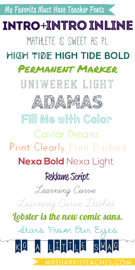
I have a mantra – “Content before pizazz.” It helps me focus. When I create something to use in my classroom, I complete the content first. Then (if I have time – ha!) I add the pizazz. Usually, this is in the form of fun font choices. Here are my top 15 fonts I like to use in my classroom for everything from decorations to student activities.
The first six are “ALL CAPS” fonts that I love to use at the tops of activities or easy to read classroom decorations.
I am also in love with the name of this font. Math for the win!
 Permanent Marker by Font Diner
Permanent Marker is a Google Font as well. This means you can use it directly on your website if you are tech savvy and have enough time to figure it out. I am lacking some of both of these needs.
I like fonts that encourage my students to interact with text. Outline fonts encourage this interaction. Uniwerek Light and the next two fonts are easily colored in by students.
If you like Fill Me with Color and are on a font binge (nom nom nom), you can download all the fonts by Misti’s Fonts right here. I suggest it. This is great for making interactive sketchnote guides for notes.
I like to have a collection of easy to read fonts, so Caviar Dreams and the next two fonts fill this need.
 Print Clearly and Print Dashed
Again, I like using the dashed option to encourage interaction. Sometime I will use the bold print clearly font for almost all of the text, but use the dashed option on key words for students to trace.
Nexa also looks great in all capitals, so I often use it for classroom decorations like schedule cards. This is one of my most used teacher fonts due to its classic appeal.
Warning: This font is a “demo” font so it does not have any special characters like a period, comma, or exclamation point. I love it so much I don’t care, but you might.

Learning Curve Learning Curve Dashed
This is the second font that has a dashed option. Learning Curve and the next two fonts are cursive because I think it is important for my students to have opportunities to decipher reading cursive. Since I teach high school, I’m not concerned with only using a certain cursive system like Zaner-Bloser (which might be important to you if you are teaching students cursive). I like these three choices because they are easy to read.
 Lobster (and why it is the new comic sans)
Lobster is also a google font. It is also widely used.
Much like with Reklame, this font is laid back. Stars From Our Eyes and the next font are both by Kimberly Geswin.
This font has special tips to make it work.
Tip 1: Use the “=” sign instead of space to make the connecting lines. Use the “(” symbol to start a phrase to make the beginning swirly and the “)” symbol to make the ending swirly.
Tip 2: Type in ALL CAPS to keep things even. Or alternate between capital and lower case letters for bouncy letters. For example, I actually typed (Kg=A=LiTtLe=SwAg) to create what you see.
If you are a visual person, you can see these tips and more here and here. If the last two fonts seemed familiar, you might have seen Kimberly on TeachersPayTeachers. She sells licenses if you want to use her fonts in your TeachersPayTeachers products. She is also a goldmine for free fonts to use in your classroom.
Thanks for joining in my font addiction.

P.S. Here’s the “pinnable” reference image with ALL my recommended teacher fonts.
P.P.S If you are looking for ideas for science experiments, check out my book Real Science Experiments: 40 Exciting STEAM Activities for Kids online at Amazon, Barnes&Noble, Indigo (for those of you in Canada), and even Target!


Leave a Reply